Building a learning management system for middle school teachers
For this project, I was tasked with building a minimum viable product for an edtech app. I decided to focus on a learning management system that would allow middle school teachers to manage their classroom online, whether hybrid or remote.
High-Level Design Objective: Design a learning management app that is functional, pleasing to use and that solves the pain points that users have with current learning management systems.
Duration: 8 weeks
DESIGN CHALLENGE
How might we create a learning management system for middle school teachers that is easy to use and helps them manage their classroom online?
Background
My research began with learning more about remote and hybrid classrooms, as well as the current goals, needs and problems teachers have while teaching during the pandemic.
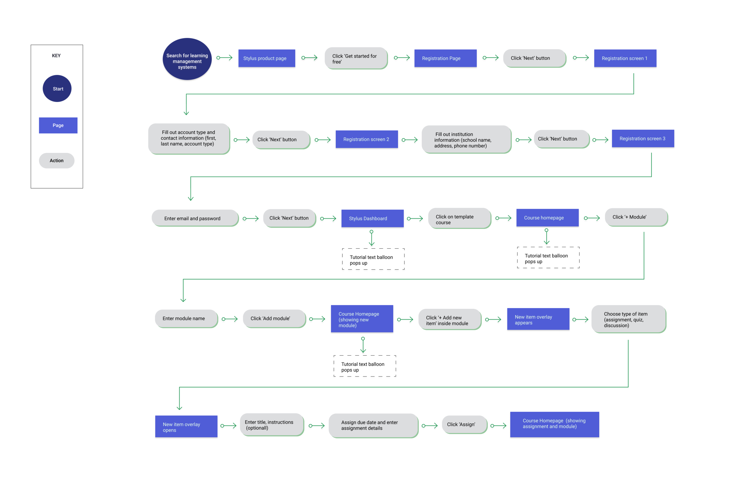
Then, I started testing different competitors to help me pinpoint possible pain points. This helped me create a current and future state key task flow.
Understanding the user
Now, it was time to validate current pain points during interviews with middle school teachers. I had participants test competitor sites to understand how they navigate the sites, as well as hear their feedback and frustrations as they moved within the process.
KEY INSIGHTS
Teachers are overwhelmed with a high number of students and priorities
Teachers want to spend less time managing and more time teaching
They want products that are easy to use and learn
Teachers don’t have time for complicated products or having to looking up Youtube videos to figure out a platform
Teaching online has been difficult for teachers and students
Participation and engagement has dwindled while being remote
They want to further organize their lessons and assignments
Teachers have a wide array of materials for their students, and they want more ways to organize them online
Defining user goals
Based on our user persona, I devised the following goals for Stylus.
KEY GOALS
Clear and easy tutorial
A thorough tutorial that familiarizes users with the platform and the most important actions
Organizational features
Giving teachers the ability to add and separate materials by modules, and not just topics
Quick and easy navigation
Simple and useful navigation bars, allowing teachers to switch between sections seamlessly and quickly
Content that reflects what teachers want
The homepage and registration pages confirm our promise to teachers: Stylus will save you time and manage your classroom so you can get back to teaching
Wireframing
I then started creating several sketches of the pages needed for the flow. After picking the final sketches that met our user goals and solved user problems, I started creating low fidelity wireframes.
Prototyping
Next stop was the prototype, which would help us test our new site with users to gain feedback.
User testing
User testing was then conducted with 3 participants, ages 25 to 40, who had previous experience with learning management systems.
Our hypothesis was:
If we familiarize users with the product during the Registration Screens and we also provide a guided tutorial, users will then easily and quickly learn how to navigate the platform.
Goal
The goal was to confirm that the flow for Stylus:
1. Solves user pain points
2. Provides an enjoyable, functional and easy experience
Tasks
Task 1: “You want to try out the free version of Stylus. How would you get started?”
Task 2:“Can you show me how you follow the tutorial?”
Overall Results
Completion rate: 100% (3 out of 5 participants)
Our hypotheses were validated:
They rated the tasks very easy to complete, with a 4.6 rating out of 5 (5 being the easiest).
Teachers also enjoyed and rated the product high in terms of being enjoyable, with a rating of 4.3 out of 5 (with 5 being the easiest).
Iteration and next steps
Changes were prioritized and made based on results from user testing.
The main change was to provide confirmation for users after they completed a main task in the tutorial.
Overlays let users know once they have completed a task and where to look to see the new module or assignment.
If further time allowed for it, we would test again to make sure that the changes improve user experience.
Reflection
Especially during this pandemic, working on a product that lets teachers work and manage their classroom online was very rewarding. I also really enjoyed being able to think about both the user goals and the business goals during the registration phase, helping prevent drop offs and increasing registration numbers.
Something that was also reinforced in me through this project was the importance of user testing. I wanted the tutorial to be concise and simple to not overwhelm users, but testing it helped me realize that users needed much more support and confirmation throughout the process.
Next case study
-

Venmo
A new way to send recurring payments in Venmo.
-

Mano a Mano
Redesigning the nonprofit’s flow to confirm grant requirements.
-

Kaus Insurance
Using video modules to increase understanding of insurance policies.


